Go here to see images before/after line editing and notes on each image.
This is Not 100×100 Part 4 Set
The first 100×100 set had 3 parts because it was big – mainly due to the fact that my program generated more levels than usual and generated images for 3x as many levels as normal (180 instead of 60).
For this set, my program went through the full process of generating 12,000 new levels, selecting 60 of them for image generation, and then generating 12 images for each level before I looked at a single image. This took about a week of processing time.
No More Rules
I broke one soft rule (twice) and two (formerly) hard rules for this set:
- I added effects post-image generation for two of the images (soft rule – I used to do this semi-frequently but the last 4 or so galleries haven’t had any post-processing).
- I included an image that isn’t the same size as the rest.
- I (gasp) changed one line in one image – not (just) the color, which isn’t news, but the actual tiles. Specifically, I split the line into two separate lines so that they could be different colors.
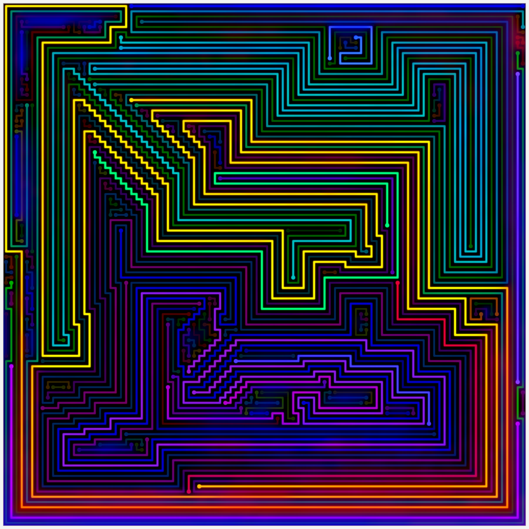
The 3rd image in this set is also the 1st image in the 111×109 set
This was done for the transition effect, which I describe on the 120×110 gallery page. I didn’t like the transition from image #2 to #4, and I couldn’t find any level in this set. I feel the 3rd image fits much better here than it did in the 111×109 set.
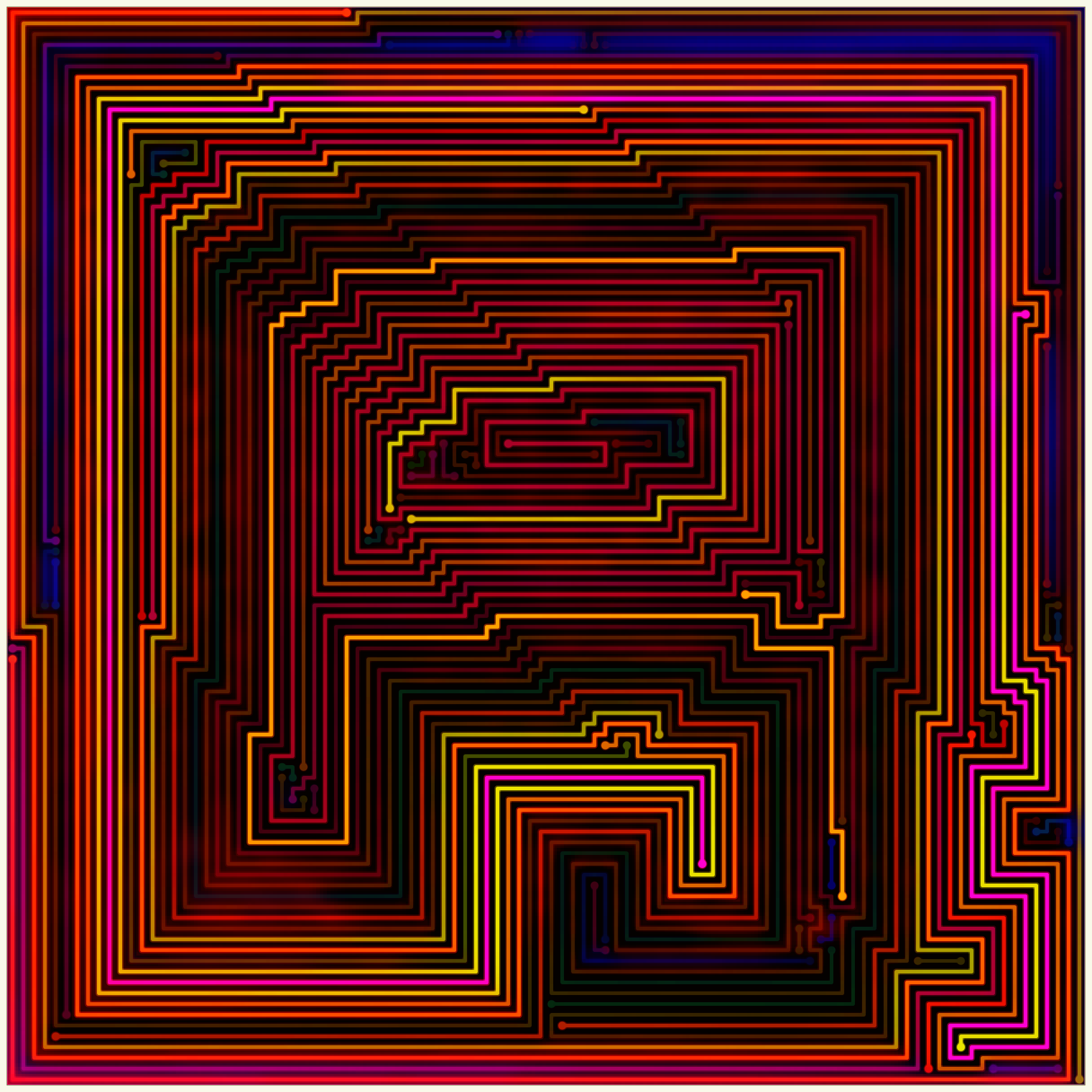
The yellow line and the orange/yellow line above it in the last image used to be the same line.
I felt this needed to happen to make the image better. I’ve never done this before and it required some amount of code to achieve.
Even More Editing Colors
I created the 132 color editing palette to help edit the last set. I still found myself wanting more in-between colors and shades, so I made a 1,104 color palette that includes 3 intermediate colors between the primary and tertiary colors (a total of 48 colors) and 23 shades of each color. For example, between red and orange, you have red-orange, red-orange-orange-red (red and orange are equal), and orange-red. Here’s what that looks like:

red to orange. R=255, G=0,32,64,96,128 from left to right.
My Typical Premature Review
Almost every time I start working on a set I hate it. Usually, when I finish the set it is my favorite set (I kind of have to do this to motivate myself to work on it). This is no exception.
By far the easiest comparison to make is with the last set (120×110) – which also has just 4 images compared to the 17+ images of previous sets.
The last set was mostly about transitions and uniqueness – something I felt I had to do because it didn’t have any real standouts (e.g., the 111×109 level 25).
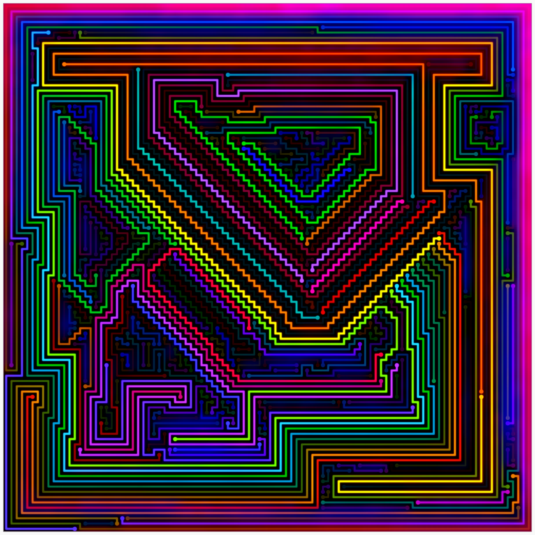
The first and last images are better than anything in the last set, in my opinion. The 2nd image has a really unique look (though a bit similar to the 3rd image from the last set). The borrowed 3rd image isn’t a standout, but it makes the set as a whole feel much more varied – though maybe not quite as varied as the previous set.
Previous gallery: 120×110
Next gallery: 80×80 Remake