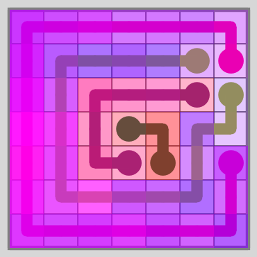
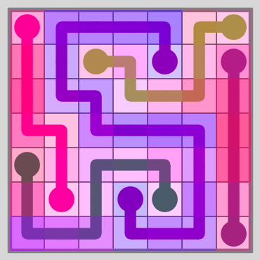
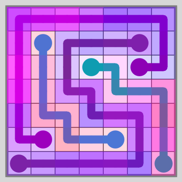
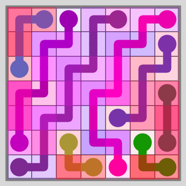
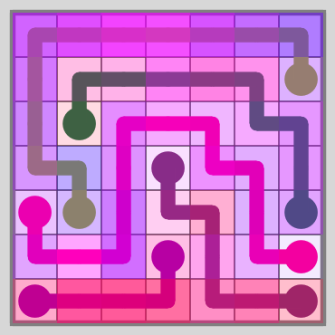
Similarity Maps are a visualization of the process used to isolate the most unique levels created by my level generator. For most of my Computer Generated Line Art, the maps are also part of the art. The shading from the maps is used for a background layer that adds a dynamic quality to the images.
Creating similarity maps begins with a level-to-level comparison.
Comparing Two Levels

Here are two basic levels with no portals or shadows. To compare them – we will go line-by-line in each level and find the line in the opposite level that contains the most of the same tiles. Let’s start with the dark green line:

The red shading shows the intersection of the two lines. All four lines on the right intersect with the dark green line – but only the line that intersects with the most tiles can consume part of the lies. In this case it’s a tie between the light green and hot pink lines; the “winner” is chosen randomly in this case.
Now we’ll look at all three lines:

Notice how the light green line on the right consumes multiple lines on the left.
One line can consume parts of multiple lines, but only one line can consume part of an individual line.
Now we will do the same for the lines on the right side:

19/36 tiles are shaded here compared to 13/36 tiles in the first comparison. The left side has fewer dots and longer lines – these levels tend to be greedy levels (more blue than red).
Here are the two maps combined:

The magenta tiles are the parts of the lines that both consume tiles and get consumed. If anyone ever told you blue and red make purple, they lied. They make magenta (at least according to the RGB computer model).
The total shading (red and blue count for 1/2 while magenta counts as a full tile) for each of these maps is the similarity score. The percentage here is 16/36 or 44%. The score is the same for both sides.
Rotation
Let’s try the same comparison again – except this time we’ll flip the right level horizontally like so:

Now the comparison:

The number of shaded tiles went up dramatically – from 16 tiles to 21 tiles – the similarity score is now 58%.
I don’t consider the rotated levels to be different from each other. Therefore – I call the similarity score for two levels the maximum score of any combination of rotations for each pair of levels. All other scores are tossed – so these two levels score 58% and not 44%, regardless of their initial rotation.
Comparing One Level Against Many
Now we’ll take the first level and compare it with 29 other levels of the same size and shape. The shading of the map is the average for all 29 comparisons:

What’s cool about these maps is that they tend to highlight the more interesting parts of each level.
This is a very simple level – but you’ll see the highlighting a lot more when comparing larger, more complex levels.
Rating Levels Based on Uniqueness
Over months of testing I developed an extremely complicated formula to rate levels that I won’t explain here. This formula is replaced with:
The image above. The similarity map is the formula. The average opacity of the shading is the score for the level. The lower the score, the better. It doesn’t matter whether the shading is more blue or red.
I used this method to select 30 levels that rated well by this method and compared them against 30 random levels. I increased the board size to 7×7 to make the levels a bit more interesting.
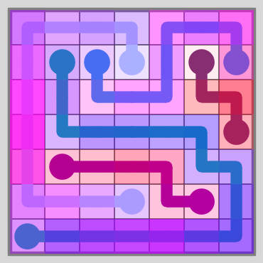
Here are the first few levels from each set:
Random Set
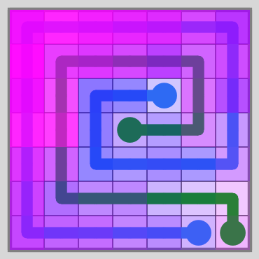
Unique Set
Here’s the average shading of each tile for both sets (I call these average maps):

The percentages indicate the average red and blue shading for each map. These maps (which I call average maps) are always going to have equal amounts red and blue when comparing a set of levels against itself.
We can also compare levels from the 1st set against the 2nd and vice versa. Here are those average maps:

The dark purple and bright red/pink rings are common when comparing a set of random levels against a set selected for uniqueness.
Why?
Random levels tend to have long lines that go around the edge of the board and shorter lines in the center. The uniqueness method filters out most of these levels because they’re not very unique.
Comparing Larger Levels
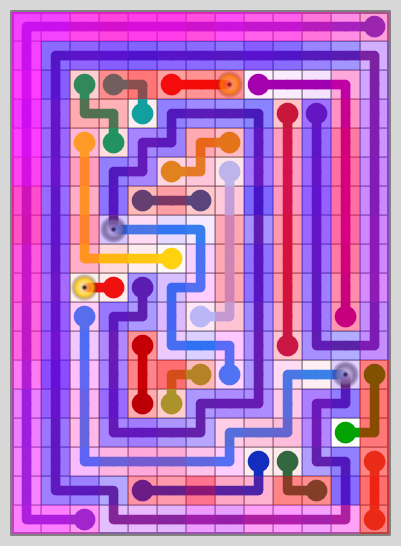
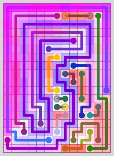
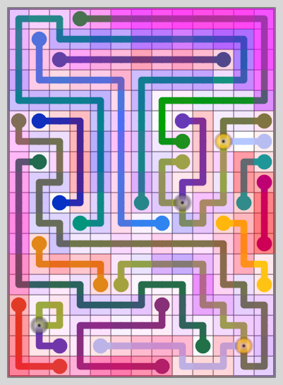
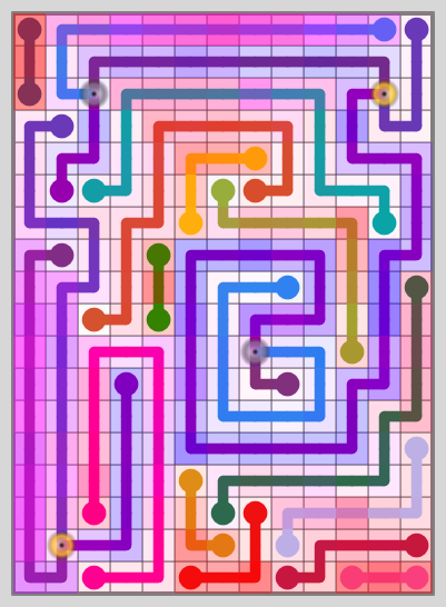
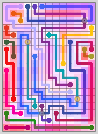
Here I’ll show two sets of levels from boards that are 18 rows high and 13 columns wide (the largest board size in CTD: Portals). They are basic rectangles without portals, shadows, bridges, or walls.
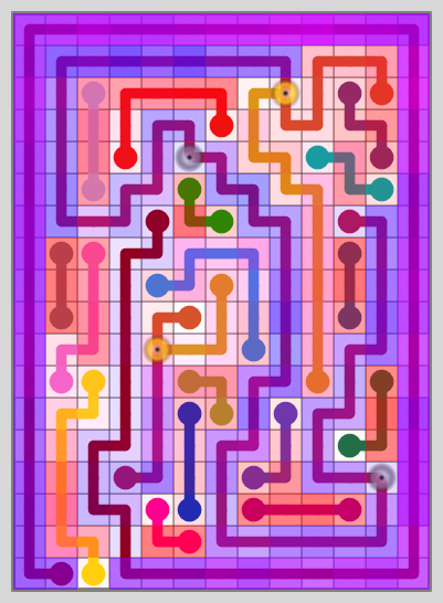
Random Set
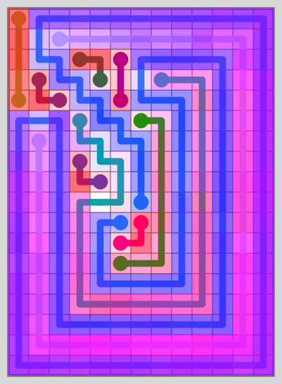
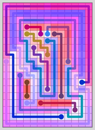
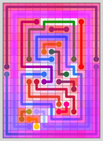
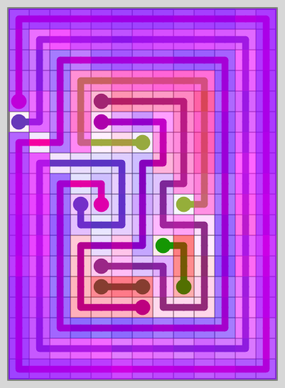
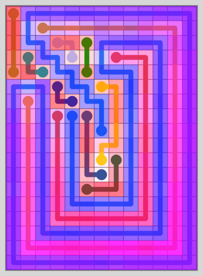
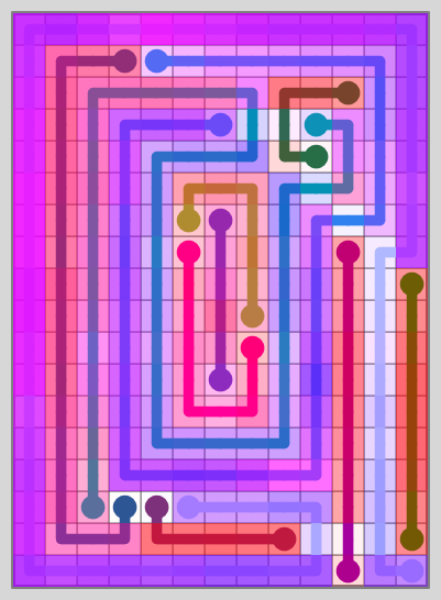
If I told you a computer program generated these levels (which it did), you would probably yawn and tell me that you could make better levels yourself. And you’d probably be right.
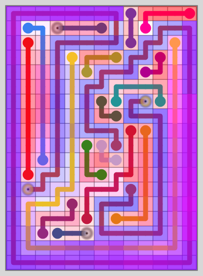
Unique Set
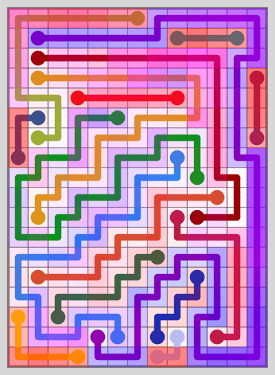
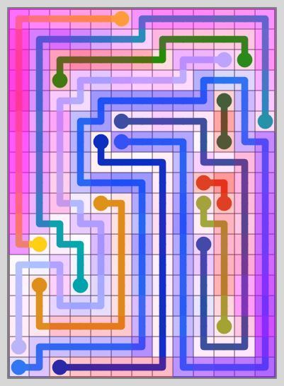
The same program that generated the levels in the first set also generated these levels – but they don’t look computer generated.
The best part is – I don’t have to explain why the levels in the unique set were chosen. The similarity map shows it. Before I show the average maps, let’s look at two more sets.
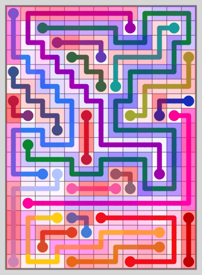
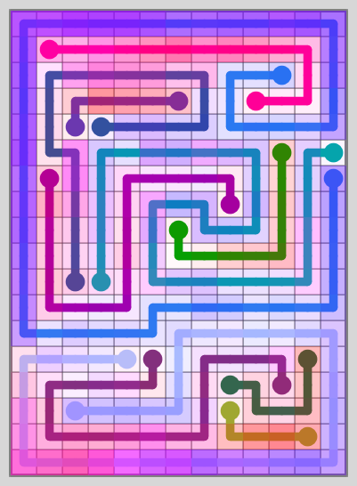
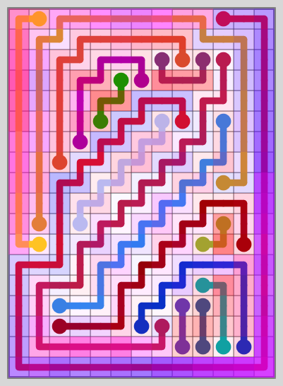
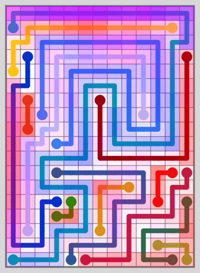
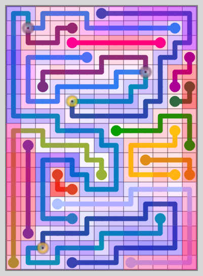
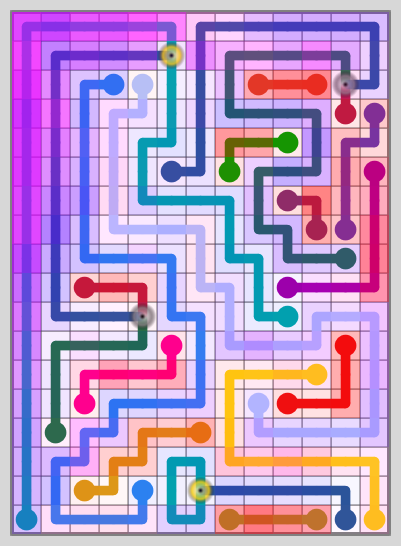
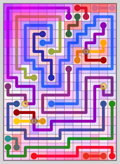
I’ll take the same board size and add two random portals to each level and run the random vs. unique comparison on these levels:
Random Set (2P)
Unique Set (2P)
Now let’s look at all four average maps:

top left – random, top right – unique, bottom left – random 2P, bottom right – unique 2P
You can see just how huge a difference the portals make – in the random levels. If you squint really hard, you might be able to see that the two portal unique set is slightly more transparent than the unique set without portals.
Still, I find the results from the filtering method more impressive in the levels without portals than those with.
The Levels Get Better with Larger Boards
The filtering improved 18×13 levels by 15.5% and 7×7 levels by 10.9%.
This improvement gets even bigger with larger sets – though unfortunately, 18×13 is about as big as I want to play on my phone.
Still, you can see examples of the results on this page:
Here’s one example:

The images generated for the page had various adjustments made for artistic effect – which often included modifying the alpha component (opacity) of the shading – so it’s not completely fair to compare these to the maps above. Still, the 50×50 set averages 31.2% opacity without adjusting for shading – a vast improvement over the 42.1% and 40.1% of the 18×13 maps above. There aren’t any portals in any of the levels either (except for the 40×20 2 Sector set).