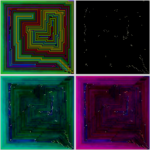
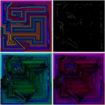
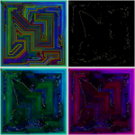
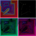
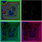
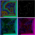
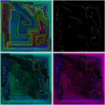
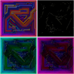
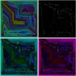
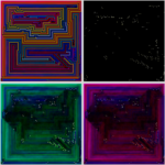
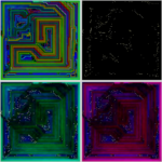
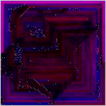
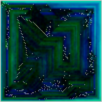
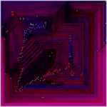
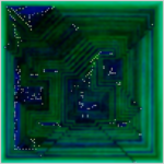
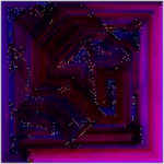
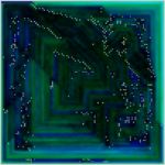
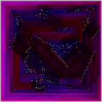
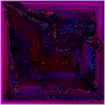
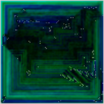
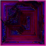
A new way to look at the images – I call them “constellation maps” because that’s what they reminded me of.
I “discovered” these in the same way that I discovered the original images that led to all of the galleries – a complete accident while working on something else.
The first half of the gallery has four images within each image:
- Top Left – The original image in the 100×100 gallery
- Top Right – The dots only against a black background. The color of the dots is randomly between light yellow and white, and the size is somewhat random too to make them look more like stars.
- Bottom Left – The “stars” with green/blue similarity shading.
- Bottom Right – The stars with red/blue similarity shading.
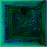
The last half of the gallery shows one full sized constellation map (with either cyan or magenta shading) for each level.
The only adjustment I made to the program itself to make these was the change to the color and size of the dots. Everything else was already there.
The similarity shading is present in the original images too – but at a significantly reduced opacity. For each cell, opacity is raised to a power (between 1.5 and 2.5, depending on the settings I used to generate the image) that reduces the opacity. For example – if it starts out at 90% opacity, it would end up at 81%, if it starts at 50%, 25%, etc.
The constellation maps don’t adjust the opacity at all from the calculation used to generate the similarity map – though when i first saw them, they were with the same shading as the images. I actually manually edited several of these to increase the brightness and saturation before I found out I could just put the shading back to what it originally was and get about the same effect.
What I like about the constellation maps:
- Only 1 image per settings file – randomizing the color of the dots doesn’t make much difference because there are no lines.
- The larger pattern tends to stand out even more.
- Some of my favorite constellation maps have relatively large area of concentrated stars – these “junk” areas often spoil the original image.
- While I’ve found that the original images with lines look quite different depending on the device (they look best on my phone where the lines are sharper and the black level is higher) – these look about the same on each device.
- Thinking about them as levels – it’s pretty impressive that one could draw lines connecting each of the stars and fill in the entire 10,000 cell grid.
What I don’t like about them:
- Some of my favorite (generally simple) levels don’t look that great.
- Less variation from image to image.
- If you didn’t know that lines could connect all of the dots – they might not be that impressive compared to the originals.
