Previous weeks:
10/27/18
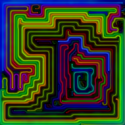
A double to end the week

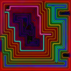
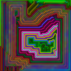
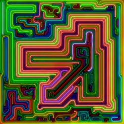
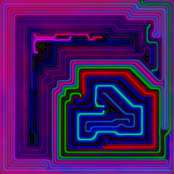
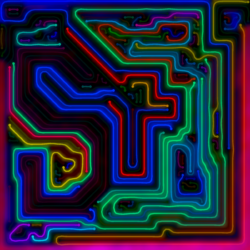
Board Size: 74×73
Edits: None
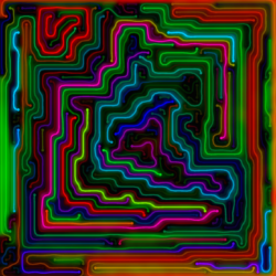
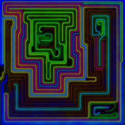
Notes: It’s looks like a parody of The Secret Pyramid, which is a big reason why I like it.

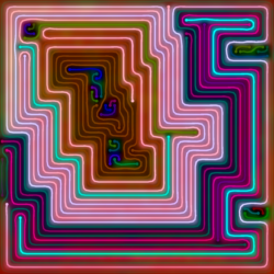
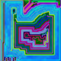
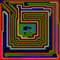
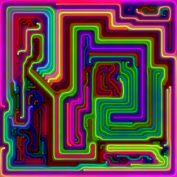
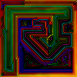
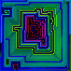
Board Size: 74×73
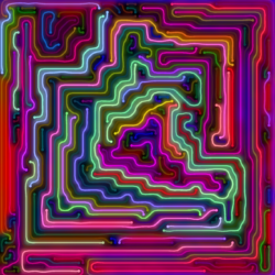
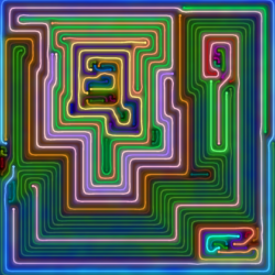
Edits: The yellow line in the top/center used to bit brighter, and while I was at it I slightly adjusted two other lines. See the original version.
Notes: Of the 360 levels I looked at for this week, this was the 298th and the other was the 299th. They were also the only two levels with this relatively rare pyramid shape, so I felt they had to be together here.
10/26/18

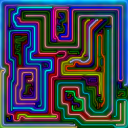
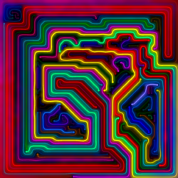
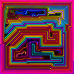
Board Size: 74×73
Edits: None
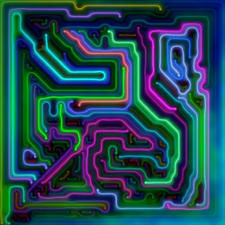
Notes: Introducing the Super Light 240Z Tint theme. If you’re wondering why there is a Z in the name of many of my themes/palettes, it is because I like the letter Z.
10/25/18

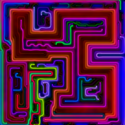
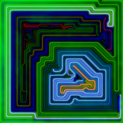
Board Size: 68×67
Edits: None
10/24/18

Board Size: 74×73
Edits: A few. See the original image.
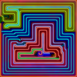
Notes: I created the theme “Light Range 240Z Modest” specifically to make images for this and one other level. This image is the result.
10/23/18

Board Size: 59×59
Edits: Yes. Here is the unedited image. Prior to that image, I saw the original, and used my program to randomly change the color of some of the lines until I found one that I liked.
Notes: The colors are from a tinted version of the Dark 24 color palette that is pretty dull.
The level has just 23 lines, and out of curiosity I checked all of the levels (over 5,000) that I have looked at with a board size of over 1000 cells and found zero levels with fewer lines. In fact, I have only seen 5 levels with fewer than 30 lines, and one of the others was the image of the day on 10/17/18.
It’s not that my program doesn’t generate levels with this few lines – it’s that similarity filtering almost never picks them because they tend to look the same.

Edits: See the original image.
Notes: This version also used a tinted theme that I called XRange 240Z Modest. Just saying.
10/22/18
A crazy day double:

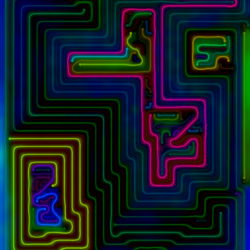
Board Size: 59×59
Edits: None
Notes: There’s an effect that I like that probably only works when viewing it on a Samsung Galaxy S8 Plus, and I’m not going to spoil it by looking at it anywhere else.

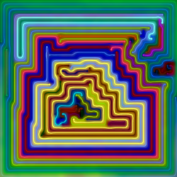
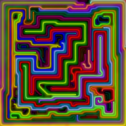
Board Size: 66×65
Edits: None
Notes: Once I got rid of the 10 other images of this pattern I considered posting that all did something better than this version, this image became one of my favorites.
The image was generated with a tinted version (the RGB triplets have no zeros) of the Light 24 color palette, which keeps it relatively modest despite the mega bright colors.
There was a reason I chose to put it next to:
10/21/18

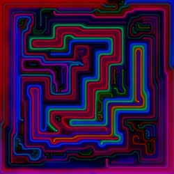
Board Size: 68×67
Edits: None
Notes: Sometimes the program gets lucky and randomly selects colors that look far from random. The four longest lines (medium red/blue/orange/green) in the enclosed bottom right area are a dead giveaway that I edited the line colors and lied about it, except that I didn’t.

At one point I was able to convince myself that I liked this version better than the first.
Previous Images of the Day
Note that this only includes the primary version of each image (unless I couldn’t decide on a primary version). The images are in reverse order of initial appearance.
