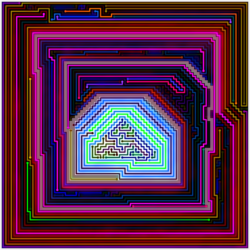
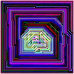
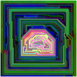
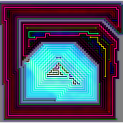
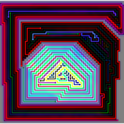
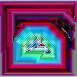
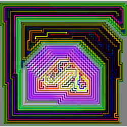
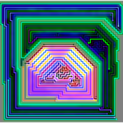
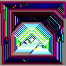
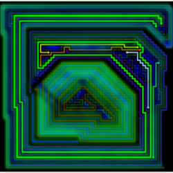
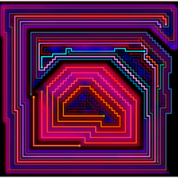
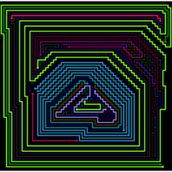
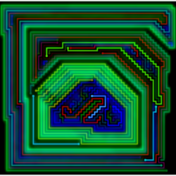
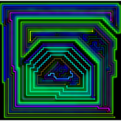
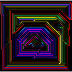
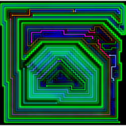
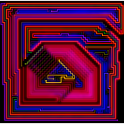
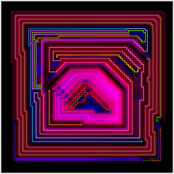
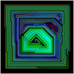
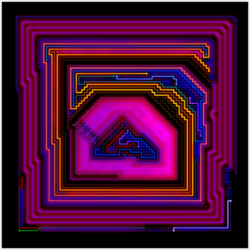
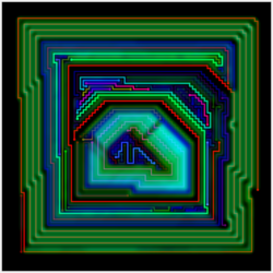
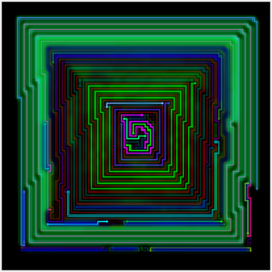
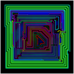
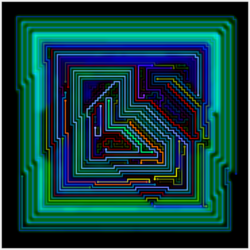
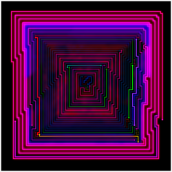
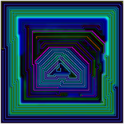
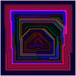
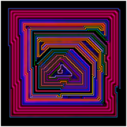
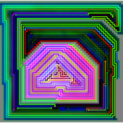
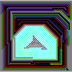
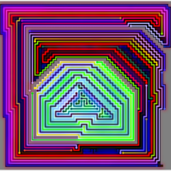
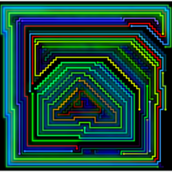
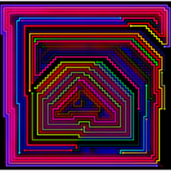
These images are exactly as they came out of my program without any manual color changes or post-processing.
The Original Goal
The main goal with these templates was to answer the question originally posed on the page: A Perfect Level
Given the cyan line only in “The Secret Pyramid”, what is the minimum number of lines required to fill the entire board according to the rules of the level generator?
A secondary goal was to answer the question: how lucky was it that “The Secret Pyramid” was generated with just 62 lines?
The cyan line divides the board into 3 sectors shown below:

Before I set the level generator on this task – I examined the lines in each sector to see if I could find ways to reduce the line count from the original level:
| Sector | Lines | Reduced |
| House | 17 | 17 |
| Middle | 39 | 35 |
| Outer | 5 | 5 |
I could find only one small area in the middle sector with lines that I could “get rid of” by extending other lines.
The Templates
These are the templates I created for my level generator to help answer the questions:


In order of appearance:
- The house-shaped area in the center of the original board (31×40 cells)
- The full-sized board with the cyan line only from “The Secret Pyramid” (91×91).
- The middle and house layers with the cyan line (65×68).
- The full-sized board with the cyan line plus the first 3 lines generated for “The Secret Pyramid.” (91×91).
- The full-sized board with only the first 3 lines generated for “The Secret Pyramid” – the cyan line was the 4th line (91×91)
There are images of levels generated of the 2nd through 5th templates – a couple images for the first template can be seen here: A Perfect Level.
The last several images are alternate versions of the original level based on the templates.
The Results
| # | Cells | Lines | Min | The Pyramid |
| 1 | 1060 | 38.9 | 15 | 17 |
| 2 | 7739 | 150.1 | 100 | 61 |
| 3 | 3679 | 98.1 | 52 | 56 |
| 4 | 5014 | 101.9 | 62 | 58 |
| 5* | 5556 | 94.5 | 25 | 59 |
*Template #5 does not include the cyan line, so is not relevant to answering either question.
With help from the level generator, I was able to answer the first question on a sector by sector basis:
| Sector | Lines | Optimized |
| House | 17 | 15 |
| Middle | 39 | 30 |
| Outer | 5 | 5 |
The reduction in the middle layer didn’t come from the level with 52 lines, but from another level with 65 lines. This level has 33 lines in the house and 32 in the middle layer, and I was able to find a way to reduce the line count to just 30 lines.
Although the sample size is not sufficient, I estimate that there is about a 0.2% chance of 62 or fewer lines given the 1st 3 lines plus the cyan line.
The Images
Selecting The Levels
For each template except the 5th, the 30 levels with the fewest lines were selected for imaging.
The Shading
The similarity maps were generated for each level by comparing it to the other 29 levels in the set.
Since the levels were generated with a well-defined pattern, this makes the shading generally much thicker on average that images in my galleries.
The shading can also indicate what parts of each line are usual or unusual:

The area inside the green square shows where these lines deviate from the normal compared to the other levels in the set.
The White Sector
A holdover from my games is that for levels where the walls or blocks separate the board into multiple sectors, the background of the sectors alternate between black and white:

The level is from the pyramids pack in Connect the Dots: Shadows
The program determined that the house area in “The Secret Pyramid” is closed off from the rest of the board, which is why the background is white.
The blocks were removed for the images where the house layer has a black background.
Examples from Each Template (Except #1)
#2 – Just the Cyan Line
“The Party House”

Only 31 levels were generated from this template because most of the levels had a lot of extra lines in the outer layer .
Besides looking ugly – it is an inefficient way to answer the first question, and an unfair way to answer the “lucky” question:
Since the cyan line wasn’t the first line generated for The Secret Pyramid, the program never had to fill in the board with just the cyan line.
#3 The Middle Two Sectors
“The Lego House”

The image was one of the few generated with the shading reduced, which contributes the the relatively flat appearance.
“The Ghost House”

With the blocks removed – the shading inside the house with a black background can either cause a neon glow or look something like this depending on the color of the lines.
With 53 and 52 lines, the levels for the above two images are the only two levels that managed to “beat” The Secret Pyramid (56 lines) for more than one sector.
#4 – The First 4 Lines
“The Glowing House”

Besides the size of the board there isn’t much difference between this template and the last:
| # | Lines | Min | The Pyramid |
| 3 | 98.1 | 52 | 56 |
| 4 | 101.9 | 62 | 58 |
I still can’t explain why the program failed to match The Pyramid for this template despite generating 3 times as many levels as the 3rd template.
#5 – The First 3 Lines
“The Invisible House”

I created this template to answer a different question: How lucky was it that the cyan line formed the house shape?
As such, instead of picking the levels with the fewest lines, my program used similarity filtering to find the levels most similar to The Secret Pyramid.
The above level ranked 1st out of the 200 levels it generated.
Alternates of The Secret Pyramid
To generate these images, the original lines of The Secret Pyramid were altered to match the above templates.
The similarity maps were generated by comparing it to the same set of levels for the other levels shown here.
“The Aquatic Pyramid”

The map for this level was generated against levels from the 5th template – the cyan line is pink and very blurry for it’s first pass around the middle layer before breaking off to form the “middle passageway” and the house layer.
“The 8-Bit House”

The shade-less image reminds me of a video game from the original Nintendo (NES).
“The Color House”

Compared to the other levels generated with this template (e.g. “The Ghost House”), the shading is much less prominent for images based off the original level.
The shading highlights the little bumps around the borders of the house.
Ironically – though the reduced shading indicates the program likes this level, it also makes for somewhat less fantastic images than the others.
There is also virtually no relation to what the shading looks like for images in this gallery and how it would look like if the level were part of a normal gallery.
Still The Best

Although this diversion produced some pretty cool looking images – none of the levels I have seen compare to the original.
The Secret Pyramid might not be technically perfect, but technically perfect does not mean visually perfect.
My program was able to reduce the line count by 7 in the middle sector:

Is the area to the top/right of the house (“The Trap”) any better on the right because there are 4 fewer lines? I would say that it’s worse, because the major lines deviate from the main pattern.
The inside of the house is where the original really shines, though:

The Secret Pyramid deviates in a way that it doesn’t look like it deviates while earning it’s name. The level on the right looks basically the same as any of the other 50 versions I have seen with 17 or fewer lines: nice, but ultimately, not that interesting.
Testing The Pyramid of The Secret Pyramid
Having looked at many different versions of the house area, I felt like the version in The Secret Pyramid was relatively unique, so I decided test the house area on it’s with Similarity Filtering.
My program had already generated 1000 levels with template #1 to find the minimum number of lines to fill this area. From these 1000 levels (plus the original), I created 3 sets of 30 levels:
- The 30 levels with the fewest lines – ranging from 15-18 lines.
- 30 levels selected by my program from the full set via similarity filtering.
- 30 levels selected by my program from all levels with 25 or fewer lines (coincidently, 25% of the levels met this criteria)
Some Funny Similarity Maps
Not surprisingly, the average similarity score for the 1st set was extremely high at 75.8%. This resulted in many levels with thick similarity shading that put the ghost/glowing houses to shame:

However, the shading was even more interesting for the couple of levels that scored relatively well. First, of course, is The Secret Pyramid itself:

The fuzzy green line (which is actually blue) and the interesting color shifts of other lines make this my favorite version of the house area of TSP besides the original.
Here’s an image of TSP’s top competitor for the best similarity score within the set:

This level has by far the most unusual similarity shading I’ve seen – which I’ll go into more detail about below. But first:
A Table With a Bunch Of Numbers
| Set | Sim | Lines/Min | TSP Sim | TSP Rk |
| 1 | 75.8% | 16.7/15 | 51.0% | 2 of 30 |
| 2 | 38.3% | 47.4/31 | 42.4% | 372 of 1021 |
| 3 | 50.1% | 23.2/20* | 51.0% | 6 of 249 |
*excluding TSP, with 17 lines.
The set statistics are based on the 30 levels chosen for each set – while TSP’s ranks are based on the starting population.
The similarity scores shown in the table are the same used to calculate the Similarity Maps – the program uses a separate formula to rank the levels.
The Program Hated Levels with Few Lines
No level with 30 or fewer lines made it into the 2nd set. Here’s a chart that shows the similarity scores for the 1st iteration of similarity filtering for the 2nd set:

The number of lines is rounded down to the nearest 5 for each level. TSP’s score of 0.530 (53%) corresponds with the start of the red line.
The Program Hated The Secret Pyramid Somewhat Less
For the 2nd set – TSP’s rank of 372 was better than any other level with 20 or fewer lines.
For the 3rd set (maximum 25 lines) – TSP was the only level with fewer than 20 lines that made the final 30, ranking 6th out of the 249 levels.
Why Didn’t The Secret Pyramid “Win” the First Set?
The Secret Pyramid’s average similarity score of 51% was the lowest in the set – however, the other level shown above had a slightly better score according to the formula.
The scores aren’t particularly meaningful because most of the levels in the set are so similar, which I will demonstrate below.
Set 2 Winners
Here are images for 3 levels that each have a claim for being the best level out of all 1021 levels according to similarity filtering:


The 1st level has the fewest lines (31) of any in the set; the 3rd level has 33 lines (3rd), and the 2nd ranks 24th with 61 lines.
I found it interesting to see how many different patterns can form within the house shape while looking at the images for this set.
Set 3 Winner

The shading made the 1st set interesting and the variation the 2nd set interesting. There wasn’t anything particularly interesting about this in-between set.
The Funny Shading In Detail
The most interesting part about this latest diversion to the original diversion is the checkerboard shading in the image for the “winner” of the 1st set.
Here is the shading on it’s own in cyan:

and The Secret Pyramid’s:

The shading is highly dependent on the set the level is compared against.
TSP’s shading against the 3rd and then 2nd set help illustrate this:


The bright green line is a lot duller and cloudier, and the bright blue virtually disappears.
Now for the “other” level:


No more checkerboard. This level actually scored much worse against the 3rd set than the 1st and 5 points worse than TSP. Against the 2nd set, it scored just a fraction of a point behind TSP.
Another Aborted Page
While I originally planned on using the above images to help explain how Similarity Maps and Similarity Filtering work, I decided to try to make art instead. The result can be seen here:
