I strongly suggest checking out at least one of the recent galleries before looking at my top 5 images (prior to the 75×75 set):
100×100 – this set has it’s own highlights that you can see here: 100×100 Highlights
80×80 –
Update 5/22/18
I’ve posted 4 new galleries since this list – which is rather outdated. I considered revising this and making it a Top 10, but decided against it since it kind of ruins the rest of them for me.
Criteria
- At least one major unique feature not seen in any other image.
- Great colors with good contrast. Note that I do not pick the colors of the lines – my program randomly assigns them. Often, I generate 50+ images for a single level trying to find colors that work.
- No major flaws. The most common flaw, in my opinion, is a significant sector of the board (usually filled with short, “junk” lines) that doesn’t fit with the rest of the board.
- And of course, it has to look great.
There are tons of great looking images in the galleries that don’t make it here as a result of not meeting either criteria #1 or #3.
The List
Honorable Mentions
The first two look great but the patterns aren’t quite unique enough. The next two have great unique patterns but have flaws. The last two meet all of my criteria, but I had to pick 5 levels and they missed the cut.
Number 5

This is the only image that made the cut from the not yet released 80×64 set.
What stands out about this the most is how well the two (yes, there are actually only 2) light blue lines outline this big, complicated and very cool pattern that essentially takes up the entire board. The fact that the rest of the board is mostly filled with muted, purple colors helps a lot. The yellow line emerging from the bottom right and looping around the red line is the perfect combination to provide the lone bright in the image.
Number 4

Set: 75×60
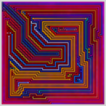
I’m not sure what’s more unusual about this level – the fact that the board is split almost perfectly straight across the board, or the fact that the top and bottom halves are totally different – yet equally cool. Or maybe it’s that despite that – with a lot of help from the coloring, everything still fits together beautifully.
Numbers 3


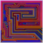
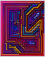
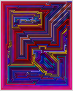
Originally only the first image was here – then I kept looking at the 2nd and felt it belonged – particularly since I was growing a bit tired of seeing tons of purple in the top 5.
The two levels have by far the longest set of what I call steps in any of the galleries to date. Thus – there is obvious similarity between the two, but plenty of differences, too.
They also both manage to keep the rest of the board interesting – which very few other levels where a massive set of steps is the prominent feature are able to do. Both are helped by the fact that the steps themselves are (mostly) similarly toned and dark compared to the rest of the level. The orange line in the 2nd level is the main exception – but this line defines a huge right triangle so I give it a pass for slightly “ruining” the ocean like feel of the center.
Number 2

Set: 70×70
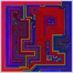
My level generator loves to draw long boring lines that go around the edge of the board. My similarity maps hates this – which is why the “boring” thick outline has heavy magenta shading. The shading combines with the colors of the lines to perfectly frame the center – an especially unusual pattern to see surrounded by straight, boring lines. The frame is at least twice as thick as any I’ve seen in all my images – not because they don’t exist, but because the similarity filtering never picks them.
The one fault is that the main reason I love this image might seem completely ordinary to someone who hasn’t looked at tons of these images. But this is my list.
Number 1

Set: 75×60
I could have reordered any of the previous four images at #2 or #5, but this is the only image I considered for #1.
My explanation: It looks super cool and no other image I’ve looked at looks anything like it.
Technical justification:
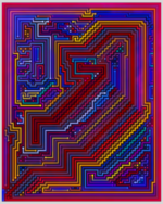
Like the previous image – this one also has a very thick frame around the center. Except the center isn’t the center – and the frame isn’t anything close to a perfect rectangle.
The line drawing algorithms that my level generator uses were designed to find “perfect” levels (a level with the fewest lines possible) given the shape of the walls. If you were to consider the yellow line a wall, its hard to imagine a more perfect way to draw lines both around it. It is equally amazing to me how the lines both inside and outside the yellow line manage to perfectly follow the incredibly imperfect pattern.
Summary
These are my current top 5 images, but I encourage you to look at my galleries and find your own.
E-mail me at DougO1081@gmail.com with your own favorites.
