Adjustments Made for the Galleries
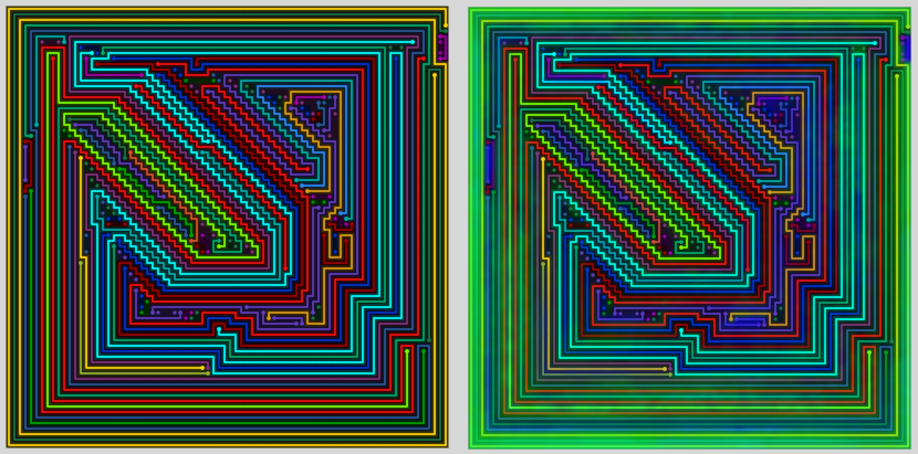
The following images show the original similarity map as shown on the similarity map page to the version in the earliest galleries:

Removing grid lines:

smoothing the shading (single pass)

Two passes:

Note that the only shading for this particular image is from the map. In future galleries I started adding “line shading” – which you see in the game itself.
To Shade or Not To Shade?
I thought the similarity maps looked pretty cool partly because they highlight the more interesting areas. Funnily enough – I never tried making images without the shading – though I change the shading colors and modified the opacity of the shading quite a bit.
Before the 80×80 gallery, I wasn’t able to reproduce the images generated for the galleries within my own program. Now that I can, I was able to go back and create versions of a few of the images with the same color lines but without the similarity shading.
Here they are:

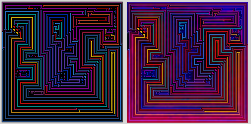

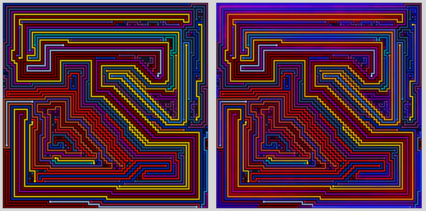
While the versions without shading aren’t bad – the shading makes each image feel more like a painting and not a level (albeit, an extremely fancy one) in a game.
A Perfect Storm
I created similarity maps with the purpose of visually illustrating a new process to find the best levels for my games.
I wrote dozens of line drawing algorithms in an effort to make more perfect levels for my games.
The maps are a made possible by the similarity filtering method devised to find unique levels. The method proved very successful for all types of levels.
My attempt to find a perfect line drawing algorithm on the other hand wasn’t successful.
The artwork was completely accidental.
- If I was successful at finding a perfect line drawing algorithm it wouldn’t exist.
- If I hadn’t made the effort to find a perfect level drawing algorithm it wouldn’t exist.
- If I didn’t come close to finding a perfect line drawing algorithm it wouldn’t exist.
- If the similarity filtering didn’t work so well it wouldn’t exist.
- If I didn’t create similarity maps just to illustrate how the similarity filtering works it wouldn’t exist.
Options and Further Adjustments
I’ve added many options since the first galleries. Here’s a screen shot:

It would take way too long to explain all these options – but there are a few major ones:
- White or black background. Starting with 50×50 – I stopped making images with a white background, because the lines were too small to stand out enough in my opinion.
- The shading colors (the two colors that matter in the latest galleries are the “Black Heat” and “Black Eat” colors). These are always some combination of Red, Green, and Blue (1 255 and 2 0s for the RGB) – and never the same color for both. They are very poorly named and would make more sense if I switched the names. By far the most common combination is what is shown about: Blue “heat” and red “eat.” The blue tends to show up in areas where there are smaller lines, while red dominates the longer lines.
- Themes – these define the color set(s) for the lines themselves. I started with the themes I use in my game (which have 20-22 colors), and added a couple additional themes for the purpose of the galleries. The additional themes are mostly subsets of the colors used in the games. All the “levels” used for the images have more than 20 lines – and some have as many as 150 lines, so the colors do repeat often.
- Randomize – randomizes the colors of the lines. This is why I make multiple images using the same settings and choose the best one to include in the gallery.
- Short “filler” lines. I consider these a necessary evil for the level generator to make “art.” In most of the galleries, the short lines (<= 4 or 6 tiles, depending on the gallery) aren’t drawn, though the dots remain.
- Short Theme – A feature I added very recently allows me to select a different color set for shorter lines (I set the default to 15 tiles, for some reason). I’ve been using subsets of the main themes for this, limiting the colors to the darker tones. I think this has made a big positive difference in the images.
Future Updates
My main focus currently is preparing the images for manual/real-time editing.
As it stands now, I am generating over 50 images for every 1 image included in the galleries and spending a lot of manual time deciding which one I like best for each level. Sometimes I make hundred of images for a single level hoping to find the “perfect” random line combination. For 90% of the images I finally settle on, there’s at least one thing about the line colors that I wish I could change.
I started saving the settings and line colors used to generate each image so that I can go back and recreate the image in my program. I’ve made it so my program can load these files. The next step is to make it so I can edit individual lines in the program.
The longer term goal is to make it so the images are in vector format – so that these adjustments could be made without the use of my program.