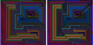
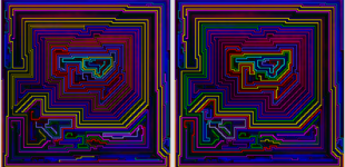
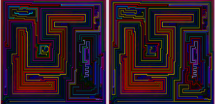
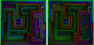
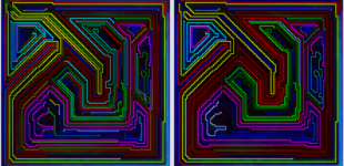
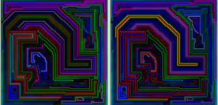
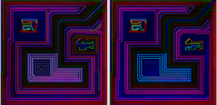
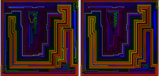
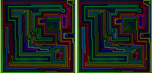
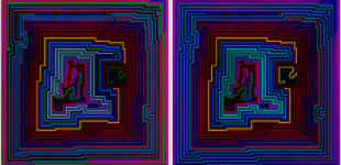
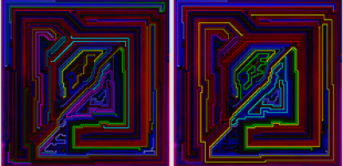
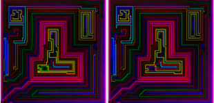
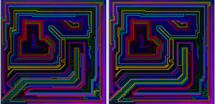
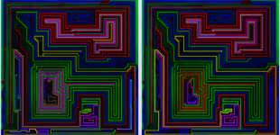
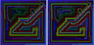
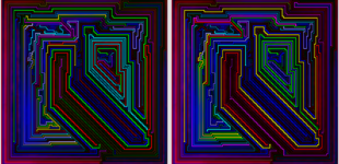
The images show the original version generated by my program with randomized line colors and my edited version next to it. On average I changed the color of about 15% of the lines which covered 25% of the board (23/150 lines, 3004/12099 tiles).
I also edited the lines of 8 images that didn’t make it into the galleries: 5 are alternate versions of levels included, while 3 levels ended up not making the cut.
Set Notes
- The average of 150 pairs of dots is over 20 more than the next highest set (101×99), it’s also the first time that the levels I selected averaged more dots than the 60 levels that the program selected.
- I used a 30-color version of the new 24 color theme, with 5 shades of each main color instead of 4.
- With only 16 (maybe 17) images it is the smallest non-highlight set I’ve published for two main reasons unrelated to the quality of the original 60 levels:
- Massive line-editing – so much so, that I can’t really call it computer generated art anymore. More like human-assisted computer generated art.
- I definitely think I’ve been far too over-inclusive in past sets – generally including an image if it had one interesting aspect. There were some really interesting and impressive patterns in this set that got passed up because I didn’t think the image fit in my gallery
- Basically, I wanted this set to look more like plain art and less-like computer generated art.
- Magenta shading wins again. 10 of the 16 images I chose for the gallery have magenta similarity shading.
- Cyan shading wins. My 3 favorite images have cyan shading – and two of them have line colors that are much more typically shaded magenta.
Notes on Each Image
These are numbered in order of appearance in the gallery.
- I spent a lot of time editing multiple versions generated by my program before settling on an image that is nearly the same as the original.
- Last one to make the cut.
- I was so happy with my effort on the area on the bottom right, that I virtually copied it for the next image. Second to last to make the cut, but only because it is a dupe image.
- The “mini-level” on the bottom right works even better with this version of the level.
- The original is kind of ugly – there were definitely better computer generated originals – but I chose to edit it because I could “see” it becoming what it is now.
- I’m going to write something separate on this one – but to sum it up, I spent a lot of time on it, and it’s my favorite image, kind of by a lot.
- Much to my surprise, this very simple looking level had the best similarity score of all 12000 levels generated for the set. I’m really happy with the edits I made on it, too.
- I was thrilled with my edits on this one too, but now I think it’s a bit over the top and the yellow/red reminds me of many previous images.
- I spent lots of time editing 3 different originals, and was so frustrated with my lack of progress that I nearly dropped it from the gallery. The version here has 2 line edits that total 45 cells in length. Each change was minor – a slight shift in tone (which sadly I regret) and a slight shift in shade. Despite my failure to improve the image – it’s one of the better images in the set in my opinion with very unique colors.
- In the first revision I tried to make the center really interesting and succeeded. It completely ruined the image though – and the center is now unchanged, which puts the focus back where it should be. The level is almost a perfect wavy pattern that is too fat. I didn’t like it until I found some humor in it – the lines really seem to stretch unnaturally to the right to fit the board, and the square gap looks completely out of place, but in an amusing way.
- This one has similar colors but to a much different effect – the center is the focal point, and in an unusual and stunning way that I haven’t seen before. The borders going on outside the center have a really nice warmth that I really like too.
- I tried to make an effort to pick unusual sets of colors for some images even if I liked another version slightly better, and this is an example. It helped that the original completely nailed the top left and top right areas, in my opinion.
- I like how it goes from a big pink shaped bell in the center to a modest pink shaped bell in the top/left/center. I can even think of possible stories connecting the two that would almost certainly involve a wild streak of this bell (as evidenced by the bright green streak).
- This one looks the most like a level in a game which is why I like it. The lines are really interesting too and frequently connect parts of the board that look separate and disconnected.
- It’s a good image and there’s nothing really wrong with it, but it feels a bit familiar.
- This is possibly an even better image (at least at first look) that feels even more familiar, and also a bit empty in my opinion.
- I still haven’t decided whether I’m going to add this image, but if I did, it’s completely unedited and very pink and I like how it looks.
Lessons from Line Editing
One important fact: I’m a programmer, not an artist. I have a pretty good eye and an almost obsessive attention to detail – which makes me respectable at editing art, but pretty terrible at creating it from scratch.
When I added the ability to manually change the color of individual lines – it wasn’t my intention to spend hours on a single image and make dozens of minor changes. Although frustrating at times, I sort of had fun doing it, though.
The lessons:
- Don’t try to make every part of the board perfect. Often, this makes the full pattern worse.
- A corollary to this is to try to look at the full image when evaluating edits, even if the edits are restricted to a small part of the board.
- I’m going to question every change I made later – so if I’m not sure about an individual change after I make it, I’m better off leaving it as it was.
- That being said – don’t be afraid to try out major changes. My image wouldn’t exist if I hadn’t.
