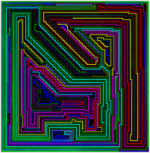
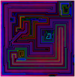
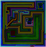
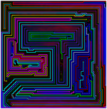
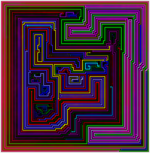
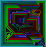
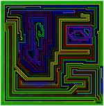
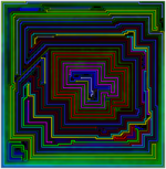
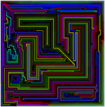
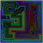
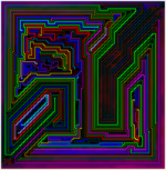
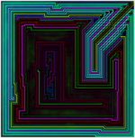
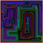
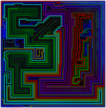
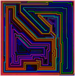
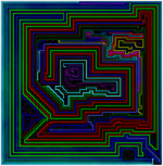
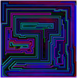
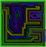
For the original versions, see the 101×99 gallery.
This is the new color palette used to generate these images:

The 6 series of colors are based off the primary and secondary RGB colors – red, green, yellow, blue, magenta and cyan – with each series having 4 tones from light to dark. The RGB values basically follow the same pattern, starting at 255 and ending at 85, though the yellow and blue columns have slight adjustments to make them slightly darker and lighter.
I didn’t come up with these colors – I found them searching Google for “large color palette.” Here is a link to the page I found them on (the theme is from the 2nd response to the question).
For lines 15 tiles or less, my program chooses the color from the last row only. This is nothing new – since the 80×80 gallery, I’ve used a subset of darker colors for the shorter lines.
Previous Themes
Since the 80×80 gallery I’ve used only two themes to generate images – one for magenta shaded levels and one for cyan shaded levels. The themes are both based off a standard metro theme that I found somewhere and use for my games.
Here is the magenta theme:

This theme (which I called RYB for red/yellow/blue) starts with the 20 colors used for my game and drops all of the greens and magenta. Why? Because early on, the images I liked best didn’t have much green or magenta.
Here is the cyan theme:

It’s the same colors but with the greens added back in – plus an additional 3 colors at the end in an effort to add more bright “highlight” colors (though, if you can’t tell the difference between the last green and the one right above it – I won’t blame you).
Evolution
In the beginning, all levels regardless of the shading were generated with the standard metro theme.
At some point around the 50×50 gallery I started using the RYB theme for some of the magenta levels. For a while I generated images with both themes – until I found I was hardly ever picking images with magenta shading and the metro theme.
Cyan levels went through a bit more complicated evolution. After the “success” of the RYB theme, I tried to do a similar modification for cyan – dropping the red/orange/purples from the metro theme (and adding a couple new green/blue shades since the palette was reduced a lot). This didn’t work out well – there was not enough variation in the colors – and only 3 of these images made it into the galleries. The result was magenta dominated images peaking at the 64×64 set where all 30 images have magenta shading.
After this failure – for a short while I went back to the metro theme for cyan levels before settling on the “RYB-G” theme above. That switch combined with the fact that I started including multiple images for individual levels made it so that there are nearly as many cyan shaded as magenta shaded levels in the galleries.
From the 80×80 gallery on I started using dark subsets of each theme for shorter lines because I found that they generally don’t add to the overall pattern and can be distracting when too bright.
I’ve also been increasing the contrast (usually uniformally) for each image since about the same time. Currently, my program adjusts the contrast before saving the initial image.
Why Change?
The short answer: I got bored with the current themes – especially for magenta levels – where yellow is practically always the standout color.
Even though I generate about 50 images for each level included in the galleries – I often found that my choices for inclusion looked extremely similar to previous levels with similar patterns.
Here is an example:

The left image is from the 70×70 gallery and made it into my original top 5. Until I ran into the level on the right working on the 95×85 gallery, I hadn’t seen anything like the first image – which basically makes the first one obsolete (admittedly, it does benefit from the contrast boost).
More Contrast
The new theme has 6 color tones each with 4 different shades ranging from light to dark. The bright shades are about as bright the previous themes while the dark colors are darker. On the RGB scale – the colors are spaced almost exactly evenly apart. The original themes have many examples where two colors are very close to each other.
More Variety
The magenta RYB theme in particular relies too heavily on yellow/orange and (less often) light blue to highlight lines – with yellow in particular dominating.
Any of the 6 tones can serve as the highlight color with the new theme – and the middle shades of each can also serve as the accent colors.
