
Notes
The four images are the best I could do given the limited amount of time I had. They are not a great representation of the 60 levels that my program picked from the 12,000 levels it generated. These are generally simpler (especially the 2nd and last images) with fewer lines. There were some good complex patterns that I passed over – but these generally take a lot of time and I didn’t see any of them with really great potential (e.g, 111×109 level 25).
Although I don’t know until after I have finished a set how my program ranked the 60 levels it chose – it was no surprise to me that only 1 of these levels cracked the top 30 (but not the top 10), and the others were ranked above 40.
Individual Notes
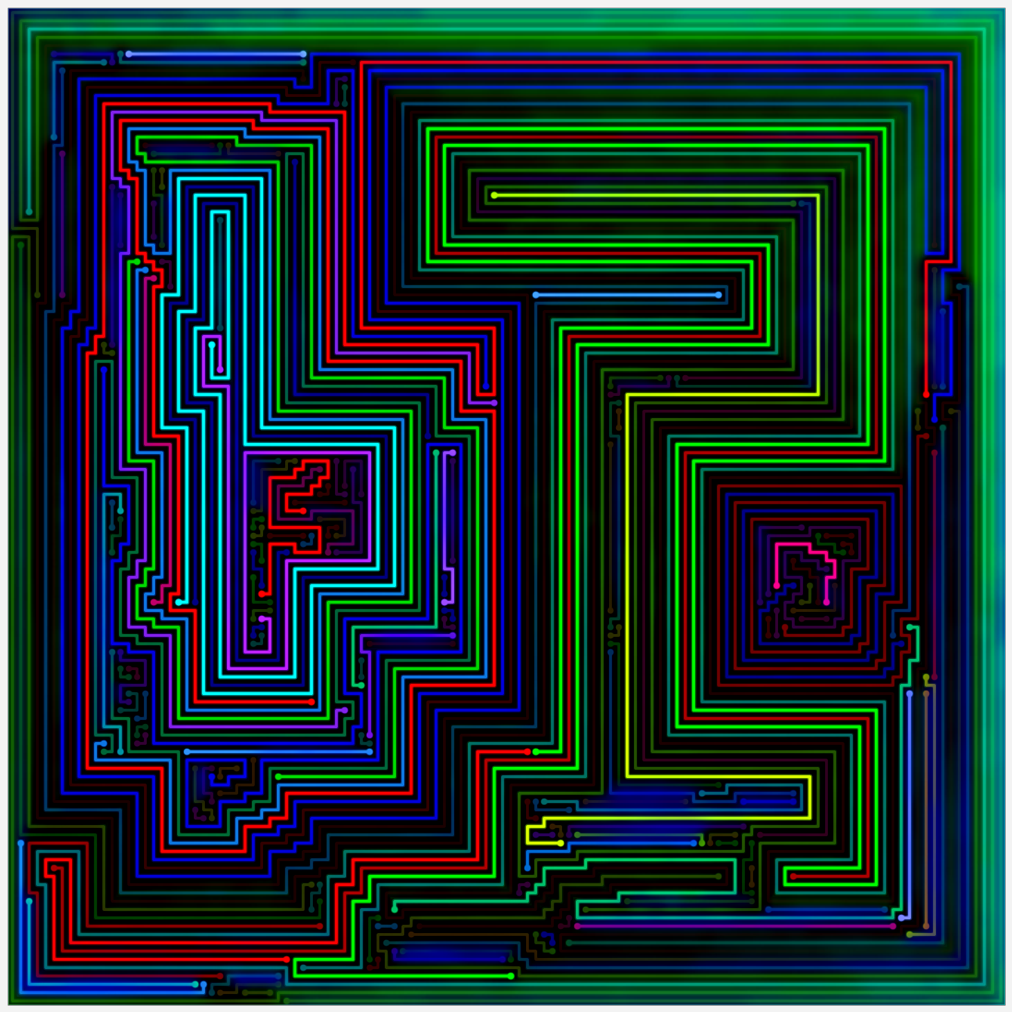
Image 1 (The Green One)
This is the probably the best pattern and image in the set, in my opinion. The basic theme has been seen before in two of my favorite images (see 101×99 and 111×109) – where the board is effectively split down the middle with a straight-ish pattern on one side and a complex pattern on the other. In this case, the straight side is less interesting than my other two favorites, but the complex side is bigger and badder.
It’s also been quite a while since I’ve had any good cyan-shaded images that glow.
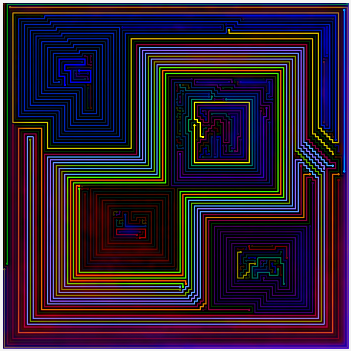
Image 2 (The Squares)
I spent more time editing this image than the rest of the set combined.
Although it is a very simple general pattern – it is also unique as of this moment. The outline is really bright and thick while the four mini sectors are very dark. The four sectors are all squarish and similarly sized but all have their own little interesting parts. The most perfectly shaped sector – the 38×38 square in the top/right/center – also has the least perfect interior (lots of short, “filler lines). The yellow line outlines a square within the square which I think really makes the image.
I spent an enormous amount of time on the bright green and orange lines in the center. Eventually – I split both of the lines into 2 lines to achieve the desired effect.
Image 3 (The Really Orange One)
I don’t have much to say about this other than that this is a case where the image made the level and not vice-versa. It is even more halloween-like than the last bright orange I’ve posted (the final image in the 120×110 set).
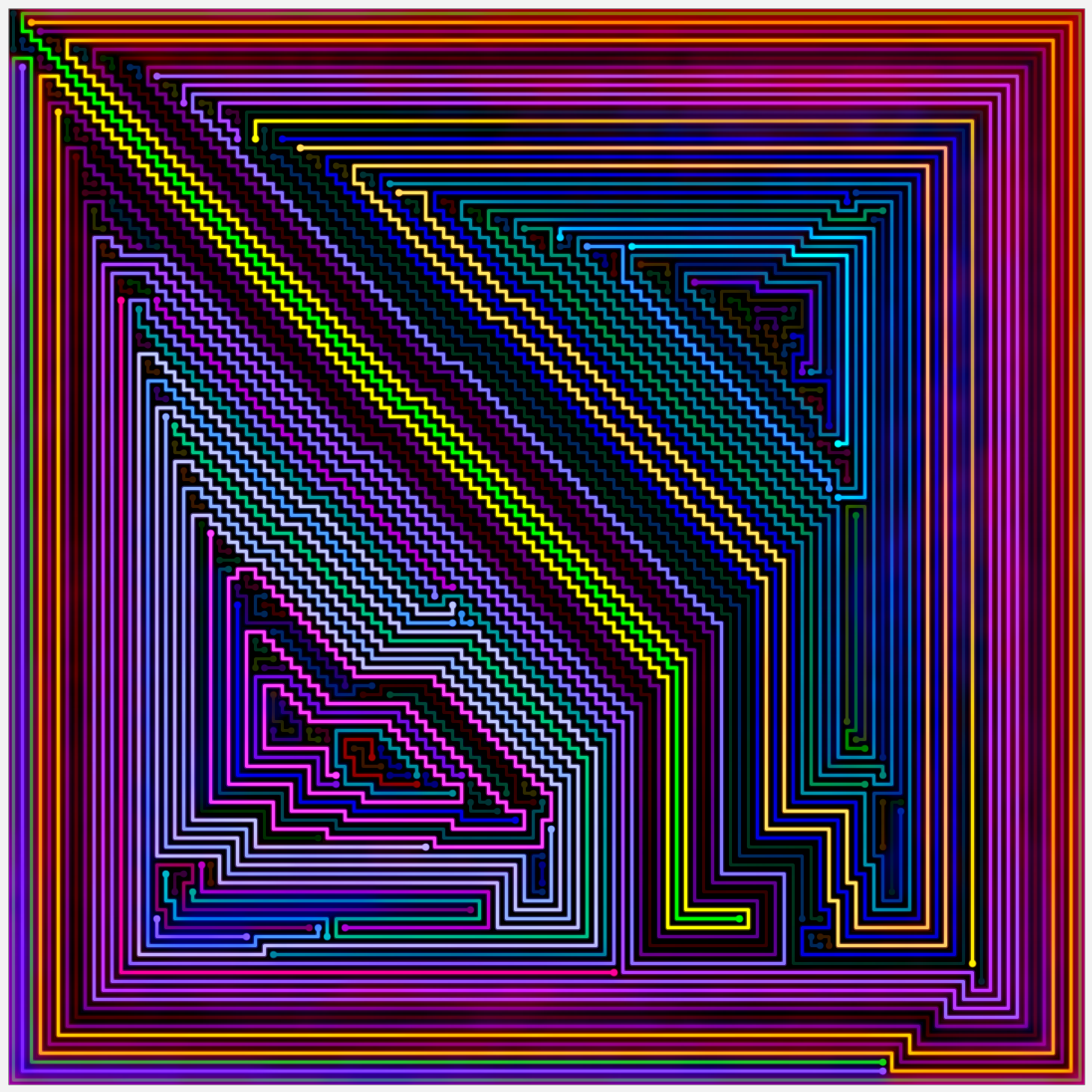
Image 4 (The Purplish One)
The main pattern is such a cliche at this point that I normally skip every level I see with it without hesitation (see 111×99 for more examples). In this case the long steps originating from the corner are very long, and the center is very off center and extremely thin. It was enough for me to justify including an image in the gallery that I really like even if the pattern sometimes make me vomit. My program also rated it the last of the 60 levels it chose, which is no surprise to me.
Previous gallery: 80×80 Remake
Next gallery: 90+91