

Experimenting with Phantom Dots
Phantom dots are the result of an unintentional bug in the level generator. They also make the levels much more interesting – my program thinks so, and so do I.
Because of this, I experimented with purposely adding phantom dots – and then phantom rectangles – specifically before drawing the 1st line (which often shapes the board). Although I’ve experimented with this in previous sets – this is the first set where every level was generated with purposely added (randomized) phantom things.
This caused the levels to score better (lower) during similarity filtering. The average level generated by my program scored 2.5% lower than the past two sets. The difference generally decreased after each iteration (each iteration cuts the population in half), but the last iteration still had a 1% lower similarity score.
For comparison, the 111×99 set (which had no phantom dots – either added on purpose or by the bug) scored between 3 and 4% higher than the average set.
Because of the better scores, I decided to generate images for the top 90 levels instead of the top 60.
I Picked a Set of 4 Images – Not Necessarily the Best 4 Images
I’ll admit – I was overwhelmed going through 90 levels with 15 images for each level. There were a lot of really good patterns, but unlike the last set, none of them so great that I knew they were going to make the final set when I first saw them. I considered 38 of the 90 levels with the goal of picking 4 or 5 for the set – though I seriously considered making it a ~30 image/unedited set similar to earlier galleries. Only one of my initial top 5 levels actually made it into the set.
Additionally – since I’ve been sticking around 90×90 for each set (and not 120×120), new levels/images are available about every 4 days instead of 14 (even with my experimental settings). I also considered waiting for the next set of images and making a combination set similar to the last, but this would have probably just added to my confusion when trying to pick the levels.
Quick Image Notes
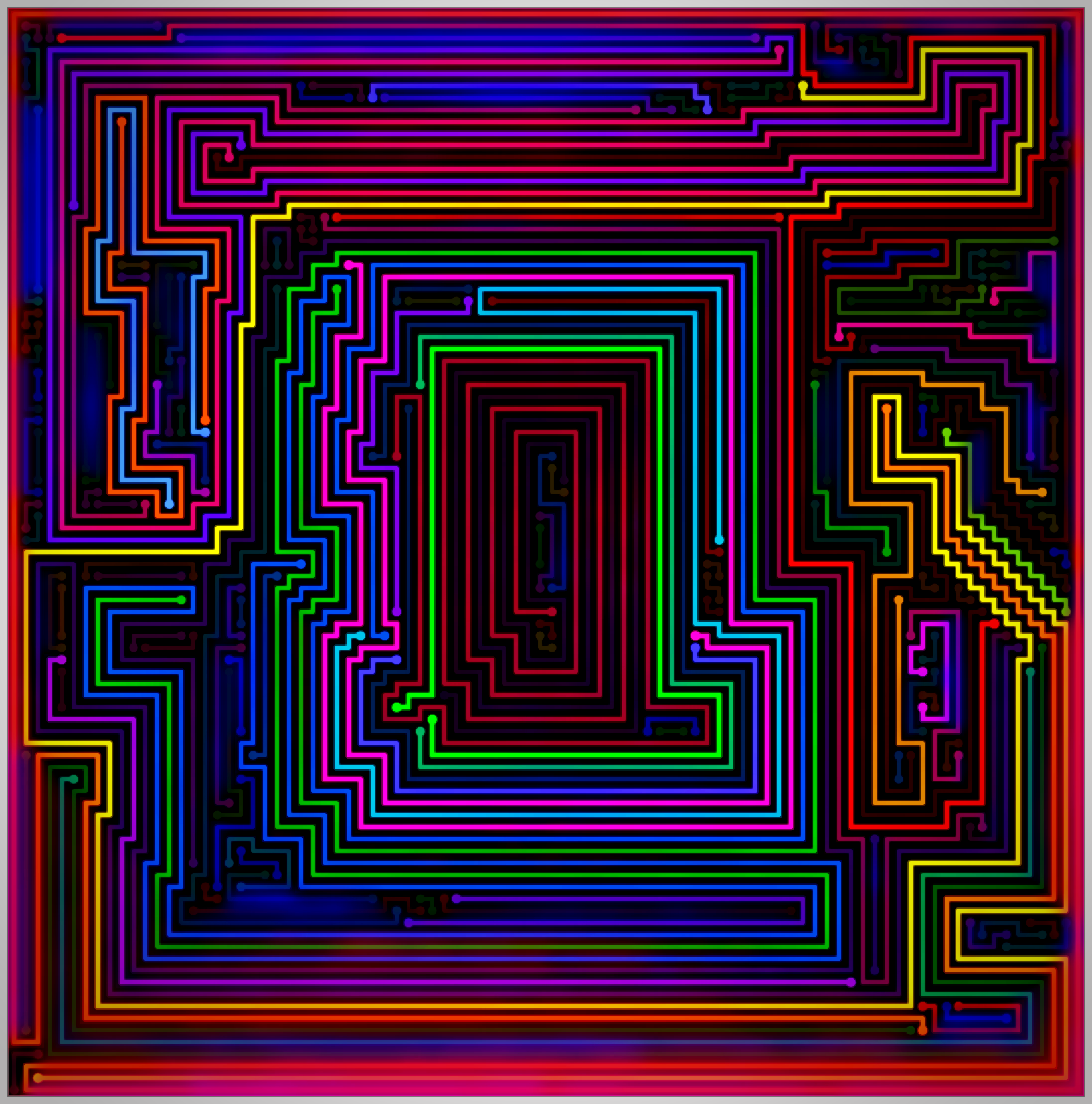
Image 1
I found the little side patterns interesting and unusual in conjunction with the big center. The center ties it in with the next image, too.
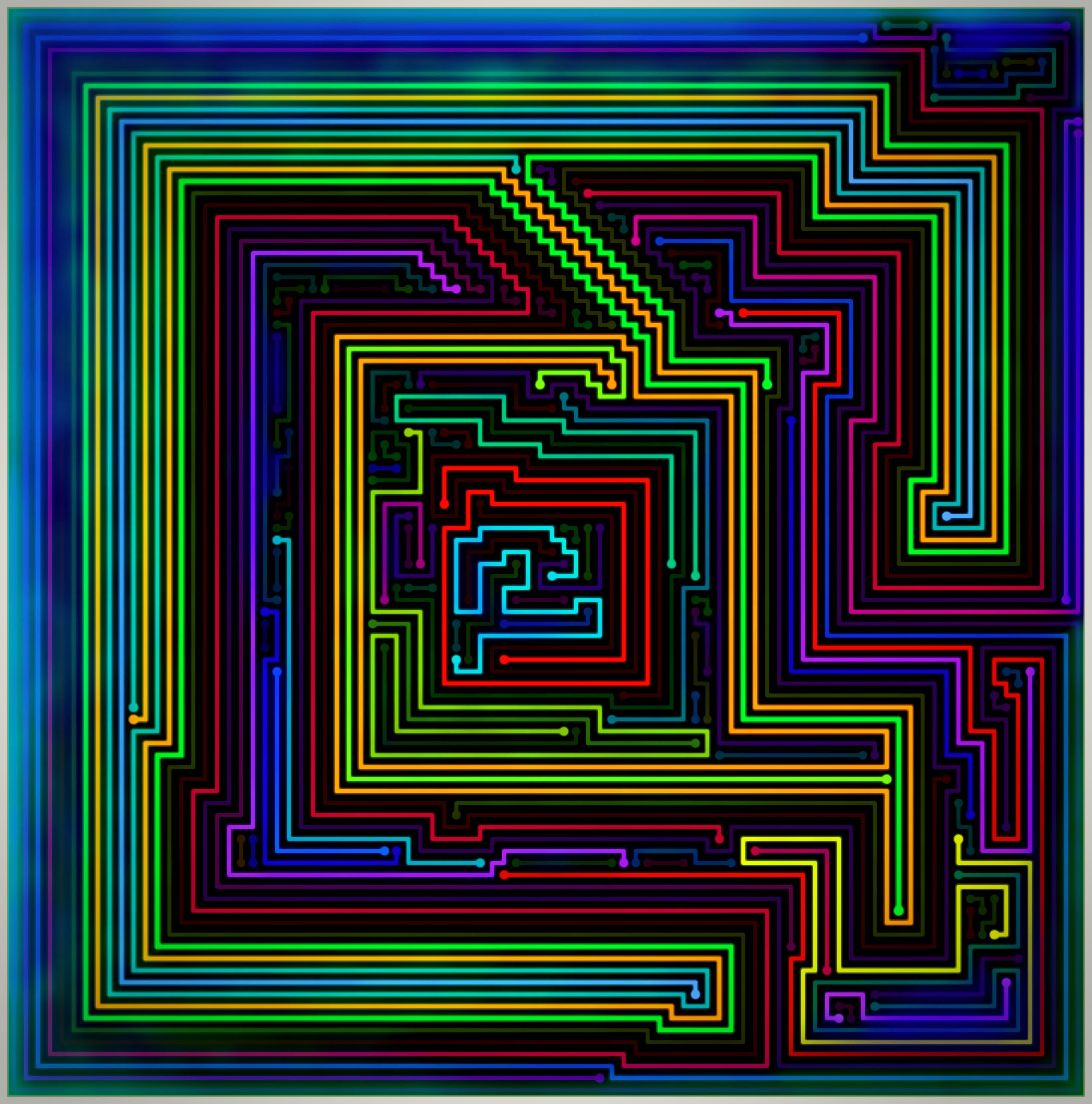
Image 2
Also a prominent center – this one is very different than the last in that the inner pattern is much more interesting than the shape. The nearly square center – and the green/orange border lines are reminiscent to the 2nd image in the 120×120 set.
Image 3
Green and orange are featured again, though the rest of the colors aren’t anything like the last image (or the two green/orange images in the 90+91 set). I really liked the effect of the randomly selected colors – though I was unable to make any significant improvements while editing.
Image 4
This was the only level that was part of my original top 5 (though, probably only #2), and I think it is fairly obvious why. While the last two images both have somewhat unorthodox colors – this one is about as typical as it gets. Still, I get to pick the colors I normally like for at least 1 image (maybe 2, if you count the first image) in a set.
The Evaluation
I knew it was going to be nearly impossible to compete with the last set (at least, in my own mind) so I didn’t try. I do feel that this set has it’s own unique feel and is at least on par with the other 4-5 image galleries. If it wasn’t the set immediately following my favorite set of all time, I could easily see myself convincing myself this is my favorite (which, admittedly, is something I am usually able to do for each new set).
Previous gallery: 90+91
Next gallery: 90×89