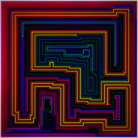
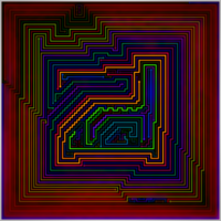
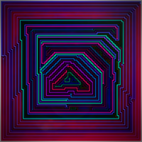
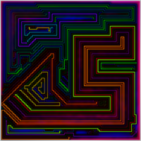
Why 90×90(ish)?
After I finished the 100×100 #2 set, I had a long time before the 120×120 set was ready, and I decided to fill some of that time by remaking the 80×80 gallery. I thought this remake was better than the 120×110 set (and subsequently, the 120×120 set). Since I originally skipped over 90×90, going directly to 100×100 from 80×80, I decided to fill the gap. It was pretty clear to me that larger board sizes beyond a certain point weren’t really making the levels better; I even felt 120×120 was too big because the lines are too thin.
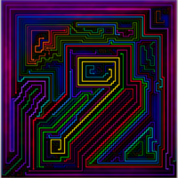
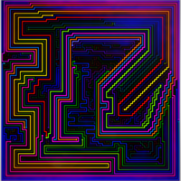
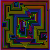
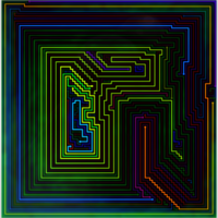
All of the Images
The 90s Theme Set
Full set here: The 90s Theme Set
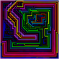
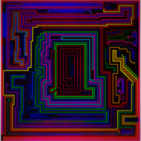
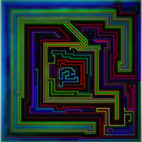
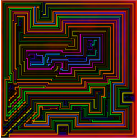
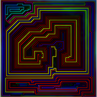
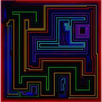
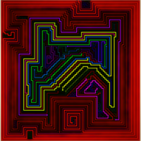
Six of the seven levels in this set are included on this page – though I made a couple of minor changes to a few of the images. There is one 89×89 image that isn’t included in any other gallery.
Level Generation Chart
| Name | Avg Lines | #/Hour | Notes |
| 90×90 | 111 | 152 | The level generator was strangely slow for this (and only this) board size given the settings used. |
| 91×91 | 114 | 176 | I used slower settings than 90×90 for this. |
| 91×90 | 127 | 121 | All of the levels were generated with some form of phantom thing added |
| 90×89 | 126 | 124 | Continuing the experiments, with a few variations in settings |
| 89×89 | 103 | 279 | The fastest settings I use – about half of 90×90 was generated with these settings |
| 89×89 Part 2 | 134 | 81 | Even more crazier phantom stuffs |
